Students of decision-making and bias will all have seen the work by Cornell psychologist Tom Gilovich, where he reviewed the experience of London residents during World War II. Richard Thaler in Nudge highlighted some of Gilovich’s work, and described how the English newspapers published maps showing strikes from German V-1 and V-2 missiles in Central London. The bombs appeared to be clustered near the City and up near Regents Park, and the Brits became worried that perhaps the German bombing campaigns were more precise than they had anticipated (and, interestingly, that the relatively untouched areas of London must be where the Germans had some spies).
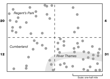
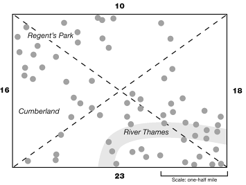
This interpretation is now known to have been fooled by the “clustering illusion”. It turns out that we (humans) often see patterns when there are none. The map above surely doesn’t “look” like it is random, but a statistical analysis of the dispersion reveals that it indeed is. When we redraw the quadrants in the same map below, the “randomness” of the bomb sites is illuminated.
We of course are big fans of the spotting biases, and discussion of the clustering illusion manifests in (borderline violent) debate about the hot-hand theory within our office and amongst our friends. We’re not going to go there in this article, however we would like to propose that – when it comes to clustering or non-clustering, it should also be that there is an antipodal possibility where there may be a pattern in data which appears random.
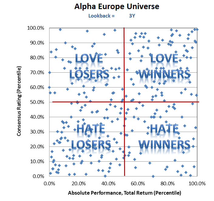
Take for example, the following dataset.
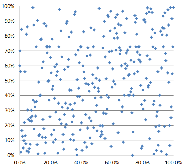
At first blush, it doesn’t look like much. A simple, linear, analysis reveals an R2 between the x and y variables of just 0.07.
I suppose this is a good time to explain what the x and y variables are. Along the x-axis in the chart above is the absolute performance, ranked by percentile, of the individual stocks within the Alpha Europe universe over the past three years. Along the y-axis is the current average analyst recommendation on that same individual stock, ranked by percentile. So, for example, Micro Focus – which is highlighted in red below – ranks in the 86th percentile of performance and is in the 26th percentile of analyst recommendations. It’s done well, and analysts still don’t like it; and as it turns out, this is fairly uncommon.
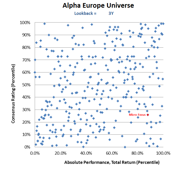
Another way of thinking about this x-y scatterplot is that in the bottom right quartile, we have a bunch of three year “winners” that sell-side analysts don’t like; a bunch of “losers” that the brokers don’t like in the bottom left, and so on. So, let’s see what happens when we do a reverse-Gilovich on this dataset.
Did you see a pattern emerge? Any clustering?
We’ve often stated that sell-side analyst recommendations offer very little informational value, and that they are basically just regurgitating any old news that corroborates their pre-existing views, and their recommendations were backward looking. And if we look across this universe, inside that table above, we observe the following characteristics:
- Of the “losers” (stocks below the 50th percentile), there is a 62% chance that the brokers are negative.
- Of the “winners”, there is a 58% chance that the brokers are positive.
- Of the companies the analysts like (stocks >50th percentile), there is a 60% chance they were “winners”.
- Of the companies the analysts don’t like, there is a 60% chance that they were historical “losers”.
When we dissect the data further (the quartiles into quartiles) the picture is even more revealing.
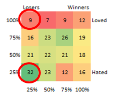
If the stock, for example is in the bottom quartile of performance, it is over three times as likely that the stock is in the bottom quartile of recommendations (32 observations) than in the top quartile (9 observations). The analogue is that hated (bottom quartile) stocks are twice as likely to have been bottom quartile performers (32 vs 16); while loved stocks were only 1.33 times more likely to have been winners (12 vs 9).
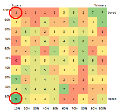
If we break it down further, the story becomes even more interesting. For example, of stocks that were in the bottom decile of performance over the past three years, nine of them were also in the bottom decile for analyst recommendations but only one of them was in the top. Similarly, of stocks that were in the bottom decile for recommendations, they were over twice as likely to be in the bottom decile of performance than the top. The bottom line is that it is very hard, for some reason, for analysts to have buy recommendations (and very easy to have sell recommendations) on stocks that have performed poorly over the last three years!
Anyway, this all puts some teeth in our hypothesis that analysts are in the business of telling you what already happened to a stock yesterday, not what is going to happen tomorrow. It also leads us to the discussion of long-term overreaction cited in the field of behavioural finance. [1] Essentially, the current or recent price of the stock almost certainly drives an “anchoring effect” for current price targets, while the historical performance of the stock appears to drive the “herding effect” that we have written about before. There are of course motivators for the herding effect too (social and institutional pressure of conformity, desire to be accepted, desire not to be an outcast, etc), and it may be that the historical performance of the stock is at least partially driving each of those tendencies.
This of course is not to say that we all should be contrary for the sake of being contrarian. If a stock has done well, that doesn’t mean it can’t keep doing well; nor should we assume that a long-term loser is going to mean-revert.
What we can say though, is that this all provides even more evidence that there is very little value in the opinions or recommendations of sell-side – or even buy side – analysts and portfolio managers (and even less in the pundits on TV). Of course these stocktwits and television broadcasts are entertaining, but for the most part everything you hear is backward-looking.
Granted, the talking heads on CNBC are paid an awful lot to describe at the end of the day what drove the market during the session as if a) it was obvious all along and b) there was some certain degree of causality between their ex-post explanations of the ex-post outcomes. They are paid a lot because many CNBC viewers, or Ira Sohn attendees, or sell-side research consumers, actually think these analyses are informational and newsworthy. Some of it may be, most of it is isn’t.
Caveat emptor.
FOOTNOTES
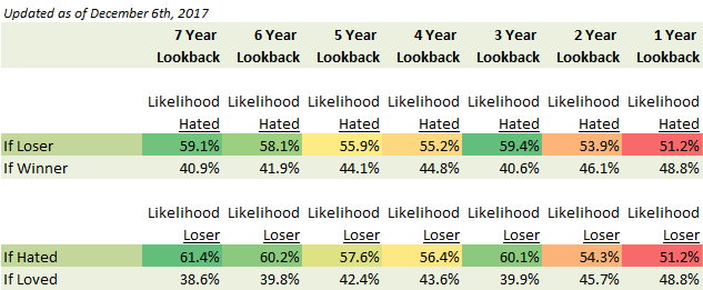
[1] We purposefully haven’t gone into it here, but there may be something here related to either intermediate term (3-12 month) underreaction or overreaction (1-5 year) stories. Interestingly, the likelihood that an analyst likes a stock starts rising as we move out toward the three year lookback window – which is coincidentally the start of the three-to-five year formation periods used by DeBondt and Thaler (1985).
Over the past decade, these longer-term overreaction stories have been attacked on methodology (e.g. the “price correction” showed tax-motivated seasonality – as there appears to be no long-term overreaction in Hong Kong where there are no capital gains taxes, the losers were three times as good as the winners were bad, or even that SMB – which may or may not be a risk – was responsible for much of the effect, etc). There also are efficient market arguments that historical losers are indeed more risky today because they have higher debt/equity ratios (so, higher financial leverage), and thus they need to generate higher returns going forward than less levered, less risky, alternatives. Then there is the statistical argument that these observations are simply due to serial (negative) auto-correlation, explaining up to half of the variation (whereas I might argue that there is an overestimation of the autocorrelation of recent trends in firm fundamentals).
Again, whether or not mean-reversion exists in long-term time horizons is not the subject of this analysis. This analysis merely is highlighting that sell-side analyst recommendations are biased, tainted, and generally useless. If anything, they are better to fade than trade.
DISCLAIMER
The views and opinions expressed in this post are those of the post’s author and do not necessarily reflect the views of Albert Bridge Capital, or its affiliates. This post has been provided solely for information purposes and does not constitute an offer or solicitation of an offer or any advice or recommendation to purchase any securities or other financial instruments and may not be construed as such. The author makes no representations as to the accuracy or completeness of any information in this post or found by following any link in this post.
YOU MIGHT ALSO LIKE
Here We Go
I will try as always to be objective here, but maybe some bias will be revealed in the process. I hope not, and I am sure you will let me know if I do. Given how politically charged things can be these days, I am bound to upset someone. That is not my intention. Not one bit. I am trying to help. I’m trying to help our investors. I’m trying to help my friends. I’m trying to help myself.
Read More.png)

